I have produced a video in a mockumentary format which evaluates my ancillary tasks individually as well as how well they link to each other and the music video.
I have produced a video podcast which evaluates the music video, scene-by-scene, from a technological point of view. This includes filming, editing etc.
It is important that I collect feedback for my music video so that I can judge how successful it would be were it made professionally. It also allows me to know how accurately I produced this video with a specific audience in mind.
I have made a survey using Survey Monkey which means I can collect a range of feedback on the video as well as ask questions about the person taking the survey (such as gender and age) which mean I will have a more accurate idea of my audience.
The survey includes questions about my audience, my music video and the ancillary tasks. Some questions are simply picking from options, but others have "Other (please specify)" options or are simply text boxes so I can gather individual feedback.
As well as creating am online survey, I have asked for feedback from people I know. The feedback I received was:
"Even though it's short, I really like the modern day bit" - 17 years old, male
"It's well filmed and edited, but I don't like the acting" - 18 years old, female
"I like the green screen bit, and the split screen's well done" - 18 years old, male
I have also produced a magazine advertisement for my music video. The magazine advertisement links with the digipak since it has the same black and colour scheme, fonts and drawings. Instead of going from left to right, the drawings now go top left, top right, bottom left, bottom right so that they take up the top section of toe advertisement, leaving a space at the bottom for information. The advert includes the same social media information as the digipak to advertise the band as well as the same titles. The advertisement also features reviews for the digipak as is common on magazine advertisements.
I have finished producing my digipak design. On the front of the digipak I have used a simple black and white colour scheme with sans-serif fonts for a simple look. The front features the title of the album which is also the title of the main song, that which we have produced a video for, as well as the title of the band. The band's name is in a smaller, more subtle font to attract attention to the song's title. On the back I have featured a track list. I put this on the back since this and the front are the panels that will be visible when the digipak is folded and the track list is what is likely to make people buy an album. Again, I use a black and white colour scheme, but I have used a red font for the title song since this makes it stand out among the other songs. I have also included a barcode and the information commonly found on the backs of digipaks. On the first inside panel I have included social media links for the band since this form of advertisement is common in digipaks.
Inside the digipak, I have used hand-drawn images of scenes from the music video. This means the digipak relates to the music video, but does not directly take from it. I have put the main song's lyrics over the drawings of the main character and I have stretched the four drawn sections over the left and right panels. The drawn sections are separated by the disc tray which is similar to the front cover, only the song's title and the band's name have been separated so that they are above and below the centre of the disc tray.
I have begun production of my digipak. I have looked at the existing digipak designs used by The Hoosiers, but have decided to ignore them as they do not suit our specific production.
The Hoosiers digipaks all follow a similar theme, simply changing the colour scheme depending on the album. They do, however, tend to be quite bright and colourful, something which I did not want to mimic. Given that the focus of our production is criminality, I wanted a darker colour scheme to represent this. Inspired by the simplicity of the Duran Duran - Greatest digipak:
I embraced a similar motif but used predominantly black for the dark simplicity I desired.
On the back of the digipak, I included a track list. Again, in want of a simple and dark look, I used a black background with white text and the same two fonts I used on the front. I wanted to make the title song stand out, given its significance in the album, so I used a bright red, contrasting everything else on the screen.
Magazine advertisements for albums and music videos tend to share common features. They tend to either include an image of the artist(s) or the image used as the album cover:
Jessie J - Who You Are - Artist image Arctic Monkeys - The Jeweller's Hands - Album art
Furthermore, they almost always advertise the album's main song(s):
It is also common to find reviews for the album on the page:
If the artist has released multiple albums, themes tend to run through their advertisements. For example, Ellie Goulding's advertisements all use the same logo, reusing the font and colour scheme which she has used in the past.
There are several types of digipak. They come in various sizes with different numbers of panels, including:
4 panels
6 panels
8 panels
10 panels
They also differ in their appearance. Some come with outside sleeves
while some have sleeve pockets inbuilt
and they all feature different images and have information, such as track lists, in different places.
I will be designing a 6 panel digipak because I feel that is enough space to include all the information pertinent to our production as well as graphics related to the video. The disc can be on either the right or centre interior panel on a 6 panel digipak. I will have mine in the centre as this is more common and, in my opinion, it looks better.
In order to produce a digipak, I will use a template (below) and the standard sizes of 5.49" X4.49".
On this day, we ventured to Moreton to reshoot the opening to the 1970s section. The previous opening was simply three still shots that get closer when cut between. We decided that we did not like these shots as, in order to keep them in time to the music, they had to last for longer than we wanted. To rectify this, we added in new close up shots to break these shots into shorter sections.
Old shots:
New shots:
Green Screen
After reshooting the intro to the '70s, we ventured back to Ryan's house to refilm some of the green screen section. Unfortunately, the lighting was very different and we were unable to replicate how the lighting had been before so some of the shots did not line up perfectly.
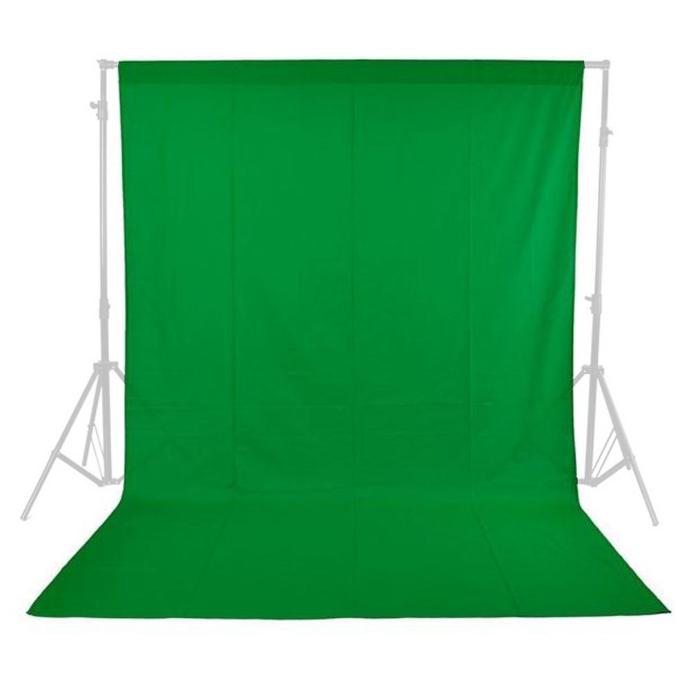
The main focus of this day was to film in front of a green screen. We purchased a green screen on Amazon for about £6. We wanted a green screen since we had the idea of intermingling all of the different time periods in a dance section during a section of the song which has no vocals. It was crucial that this was done on a green screen since each time period had to have the same background so that there was some consistency holding each shot together. We decided upon a white background since a plain background looked better and white offered a nice contrast to the character where black may have blended in with some of his darker clothing.
Shooting in front of the green screen was fairly simple, especially since the camera was not to move throughout the process. We did, however, encounter some difficulties. Firstly, the green screen was shipped folded, meaning there were creases that needed to be flattened out in order to get the background looking right. Usually, in the industry, a rig would be used to support the green screen, stretching it out and removing any creases. We could not use a rig since one was beyond our budget so we simply had to try and stretch the screen as much as possible before attaching it to a wall with tape. In a moment of poor decision, we attempted to iron the green screen in order to remove creases, but quickly stopped once we melted through a small section of it. Luckily, this section was in the corner and could simply be placed on the floor out of shot.
The main issue we had when filming the dance section was the dancing itself. Our choreography was, in truth, lacking and this was not aided by Ryan's inability to dance or lack of flexibility. We wanted to use dance moves which represented the character in each time period (hence the Saturday Night Fever thing going on in the above picture), however our lack of knowledge in regards to dance moves meant we were left to improvise, knowing only the types of actions we wanted for each character (for example, we were aware that we wanted the 1970s character to act more eratically than the others).
We started filming at about 9:00. We met in Moreton to re-film certain shots for the 1970s section. Our main focus on this day was to sort out issues concerning lip syncing. We managed to collect clearer shots this time which were usable in the final version. It took several attempts to get shots that looked good, but we now knew what we were looking for so we had an aim, unlike when we first filmed where we did not know if a shot was going to be lip synced well enough.